
Project Overview

Let's begin with the basics!
The following step was finding out what are the reading habits in Portugal.

And how about the interactions with neighbors?
63%
Don't talk to their neighbours beyond greetings
38%
Would interact over literary interests
93%
Would be willing to exchange books
46%
Own books that they will nor re-read
The survey was originally conducted in Portuguese, but you can take a look on the English version here and you can see all the results here.
What I concluded:
Respondents are open to literary activities and book sharing.
Opportunity exists to improve neighborly interaction on literary topics.
Many in the community read regularly, with potential to engage more.
Solutions like book clubs and digital platforms can enhance community literary engagement
With this data in hand, I felt the need to have a more comprehensive and in-depth information…
Which is why I transitioned to using a qualitative method with in-depth interviews. A total of five interviews were conducted online, respecting three different reader profiles. The goal was to gather information about their opinions, behaviors, and preferences. The different profiles were experts (people that read more than 12 books per year), avid readers (people who read less than 12 books per year) and Non-readers (people who read one book or less per year).
Here are some of my insights after these interviews:
All three profiles prefer physical books
The significance of sharing experiences is highly valued across all profiles
The social context plays a pivotal role in promoting reading habits
They demonstrate familiarity with popular apps such as Instagram, Netflix, Spotify, and WhatsApp
Avid readers engage mainly in the Goodreads platform
And who would be the target audience?
Before proceeding with the solution, I found it useful to create personas for each segment of the target audience. This helped me understand the needs, desires, pains, and obstacles of potential users. Here, I'll be presenting just one of these personas as a case illustration, you can see the full version here.

And how about the competitors?
To help me come up with a solid plan, I laid out some goals for the market research:
Check out what our competitors or market leaders are doing well and learn from them.
Find areas where we can make our app even better by learning from what others are doing.
Get inspired and find fresh ideas that can set us apart and keep us innovative.
Take a close look at how other apps look and work to spot any design trends or ideas we can use.

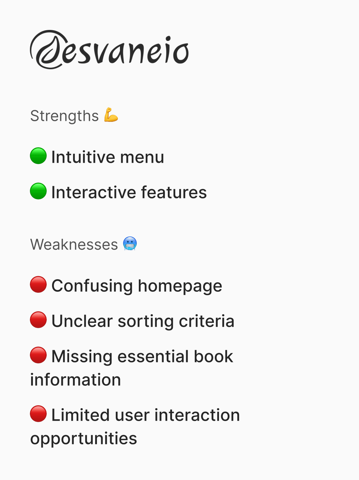
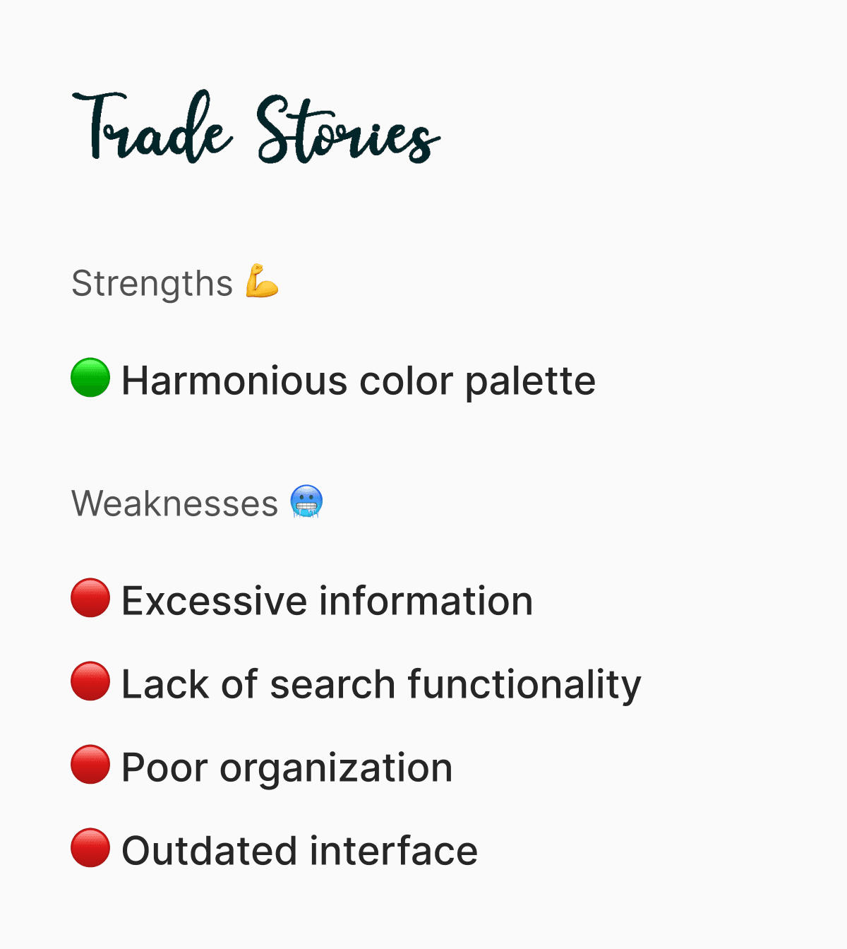
The insights collected from this process were crucial in guiding the development of the digital solution. And from that, I moved to the…
… Ideation phase!
Before I even started sketching out the solution, I wanted to make sure I got the foundation right. It was really important to me that the information architecture felt natural and easy to use, kind of like walking through a well-organized library where everything just makes sense. To get there, I searched for the data on benchmarking and tree testing. It was all about understanding what works best for people.
I was sure of one thing: simplifying the addition of books and integrating location-based recommendations was essential to enhance the engagement and success of the application.
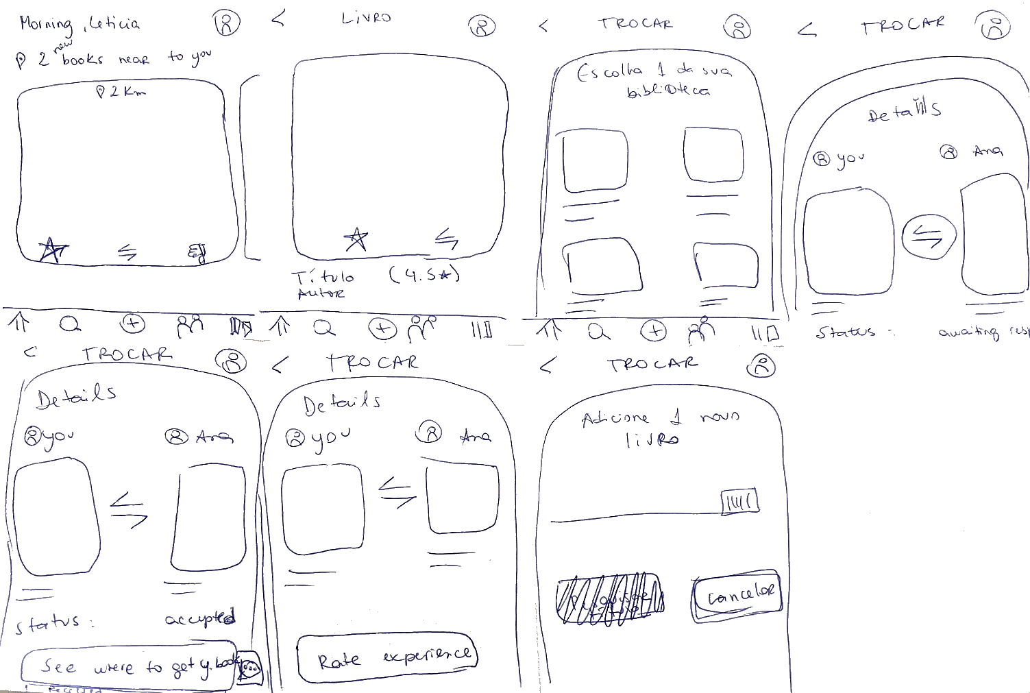
Given the tight timeline I was working with of just one week for this phase, I focused on two crucial tasks from the app: the process of adding a book to the library and the process of swapping a book ensuring that every step of the user flow was thoughtfully crafted.
Wireframes — First Proposal for the App
I began by crafting simple wireframes, aiming to create an experience that would appeal to both avid readers and non-readers. Drawing from insights gathered during interviews and research on popular apps, I integrated familiar features while adding unique touches specific to our context. A 'Crazy 8' brainstorming session helped infuse these ideas into tangible designs, ensuring the app would be intuitive and welcoming to all users.

Figma Prototyping for Concept Validation
The prototyping phase was crucial for visualizing and refining one of the most essential components of the platform: the book exchange flow. Given the central role this functionality plays in the overall user experience, it was imperative that I paid special attention to this part of the design.


After concluding the prototyping phase of the application and feeling that it was ready to move forward, it was crucial to go through the User Testing phase.
User Testing
In the tests, I aimed:
To assess the usability of the Luma app in two phases - initial test and retest - to identify navigation and usability issues and validate the effectiveness of improvements made after the first test.
Participants: 6 users in the initial test via the Maze platform (in mid-fidelity) and 2 users in the retest with moderated interviews (in high-fidelity).
Methodology: The initial test was conducted using the Maze platform for remote and non-intrusive data collection, while the retest was carried out with moderated interviews to obtain detailed and contextual feedback on the implemented changes.
Let me tell you about the initial test:
Nine participants tried to search for a book of interest, make a book exchange request and add a book to the app library in a mid-fidelity version of the app. The test was conducted on Maze platform, allowing for indirect and efficient data collection of their interactions. This method facilitated the observation of how users interacted with the app without a moderator's presence, providing a more natural and representative test environment of daily use.

100%
of users were able to complete the mission
70%
Misclick rate
67%
Clicked the "wrong" buttons on the homepage
I´ve got some important insigths in this phase!
The heatmaps showed that users did not follow the expected path.
The screen "Book offer" was particularly problematic with a deviation rate of 100%.
Only 16.7% managed to complete the book exchange on the first attempt, and none completed the task without issues.
The high rates of wrong clicks on various screens may be due to the intermediate design phase or confusion in the interface.
After that, I needed to retest.
For that, I opted to apply a moderated interview with two participants in a controlled environment. During this phase, they performed the same tasks as in the initial test, but using a high-fidelity version of the app. It allowed me to gain a deep understanding of their experiences and receive real-time feedback. This method provided detailed insights into the effectiveness of the improvements and the users' perceptions.


And here some of my insights:
Navigation: No users got lost.
Home Page: Reduced confusion with visual adjustments and transition to high-fidelity versions.
Offer Page: There is still confusion despite navigation improvements. Users seem to emphasize images.Despite overall navigation improvements, the "book offer" page remained confusing.
Some quotes from the user test sessions:
With that information in hands, it was time to make some changes...
I've decided to make it more "visual" for users to understand which was the book they wanted and the one they had to "offer", which was one of the issues raised by the users being interviewed.


We needed a brand, so I've made one...
Part of this project was also to create a brand identity and some visual design assets to the app. Things like the logo, typography and colors were all designed by me.

High Fidelity!
In the development of the high-fidelity prototype, the primary goal was to provide an accurate and detailed visualization of the final interface.
In the design process, I prioritized consistency by frequently consulting the style guide. I paid special attention to visual hierarchy and information flow for intuitive navigation. Animations were thoughtfully applied to enhance the overall experience, striking a balance to avoid overwhelming or distracting users while adding an extra layer of interactivity.


If you’re curious you can check the prototype here.
What would I do if I had more time?
Vision:
Provide an intuitive book exchange experience for users, and allow them to efficiently organize their favorite lists.
Road Map:
Q1:
Investigate other potential friction points and implement adjustments
Requirements analysis for favorite list organization functionality
Q2:
Development of wireframes for list organization interface
Prototype testing to validate usability and efficiency of the functionality
Future Tasks:
Perform more usability tests
Implement potential extra changes to the offer page
Incorporate user feedback for ongoing platform improvements
Create favorite list organization functionality, enabling users to categorize and manage their selections efficiently and personally
Test and iterate on the favorite list organization functionality.
Thanks for reading this case study. If you have any questions or simply want to learn more about it, please reach out by email to hey@uxleticia.com or through LinkedIn.